A product design case study exploring how to unify fragmented learning into one clear career growth experience.
StageUp is an original product design project created to solve a problem I experienced firsthand as a learner.Professionals today learn from multiple platforms at the same time. Coursera, Udemy, YouTube, and LinkedIn Learning are all great on their own. But each platform tracks progress independently, leaving learners with no single place to understand their overall skill growth or how close they are to their career goals.This case study walks through my full design process. Starting from identifying the core problem through research and information architecture, to wireframing, high-fidelity design, and an interactive prototype. The result is a product that connects fragmented learning to real career outcomes.
My Role: Solo Product Designer
Tools: Figma, FigJam, Notion
Platform: Web and Mobile
Deliverables: Research, Information Architecture, Task Flow, Wireframes, High-Fidelity UI, Interactive Prototype
Learners building professional skills today face a fragmented experience. Using multiple platforms at the same time creates challenges that go beyond just staying organized.
Key Pain Points
Fragmented Progress Tracking
Learning progress is scattered across platforms, forcing users to manually track their own development with no unified view.
Inconsistent Progress Metrics
Each platform measures progress differently. Some use certificates, others use percentages, hours, or no tracking at all.
Weak Connection to Career Goals
Most platforms focus on course completion rather than long-term skill development. Finishing a course does not tell you how close you are to your goal.
Low Motivation Over Time
Without clear visibility into skill growth, learners lose momentum. Progress feels invisible even when it is real.
Difficulty Demonstrating Skills
When applying for jobs or promotions, learners struggle to communicate their actual skill level because their progress lives across five different platforms.
StageUp acts as a connective layer between learning platforms. It syncs learning activity from Coursera, Udemy, LinkedIn Learning and others, maps everything to a unified skill profile, and recommends next steps based on the user's career goals.Rather than replacing existing platforms, StageUp makes them work together. Users get one place to understand their growth, track their progress across all platforms, and stay motivated toward a real career outcome.
Key capabilities:
Learning Sync
Connects to multiple platforms and pulls in learning activity automatically.
Skill Mapping
Translates completed courses into skill tags such as UX Design, Data Analysis, and Product Strategy.
Skill Growth Visualization
Shows how skills are developing over time through charts and progress indicators.
Skill Gap Identification
Compares current skills against a chosen career goal and highlights what is missing.
Personalized Recommendations
Suggests the next course or learning path based on where the user is and where they want to go.
To understand the problem space, I reviewed the four major learning platforms that professionals use most. Coursera, Udemy, LinkedIn Learning, and YouTube. I analyzed how each one handles progress tracking, goal setting, and skill visibility.
Guided Onboarding Improves Engagement
Learners who go through a structured onboarding process understand the product value faster and are more likely to continue using it. Platforms that drop users directly into a course library see higher drop-off rates.
Goal-Driven Personalization Increases Retention
Users stay engaged when the product connects their learning activity to a specific career outcome. Generic course recommendations do not motivate the same way a personalized learning path tied to a real goal does.
Visual Progress Motivates Learners
Charts, milestones, and skill indicators sustain motivation far better than text-based summaries. Seeing growth visually makes progress feel real and worth continuing.
Mobile Users Need Simplified Dashboards
Most users check their progress quickly on mobile. Information needs to be scannable, prioritized, and immediately meaningful. Not buried inside menus or data-heavy screens.
Normalizing Learning Data Across Platforms
The biggest design challenge was not visual. It was structural.Different platforms track learning progress in completely different ways. There was no universal standard to work with.
Coursera
tracks progress through certificates and course completion.
Udemy
tracks progress through percentage of video content watched.
LinkedIn Learning
tracks progress through hours spent learning.
YouTube
has no progress tracking at all.The challenge was: how do you take four completely different data formats and turn them into one meaningful skill profile?
The Solution to the Challenge
StageUp solves this by converting all learning activity into skill tags weighted by engagement depth.Completing a full course sends a strong signal. Watching part of a video sends a lighter signal. Courses that include hands-on projects carry a higher weight than passive video content.This creates a dynamic skill profile that reflects what users actually know, not just what they started or clicked on.This was the most important systems design decision in the entire project. Without solving this, the rest of the product could not exist.
Sarah Mitchell, 26
The Ambitious Career Switcher
About
Sarah is a marketing coordinator who wants to transition into UX design. She is taking courses on Coursera and Udemy at the same time while watching YouTube tutorials on the side. She is motivated and committed but feels overwhelmed because she has no clear picture of how far she has come or what she still needs to learn to land her first UX role.
Goals
Track all her learning in one placeUnderstand exactly what skills she has built so farKnow what is missing before she can apply for UX jobsStay motivated through a long career transition
Frustrations
Has to check three different platforms to understand her progressCannot connect her completed courses to real job requirementsLoses motivation when progress feels invisibleDoes not know which course to take next
Behaviours
Learns in short sessions on mobile during commutesChecks progress frequently for reassuranceSearches for job postings to understand what skills she needsUses LinkedIn to research what designers in her target role have studied
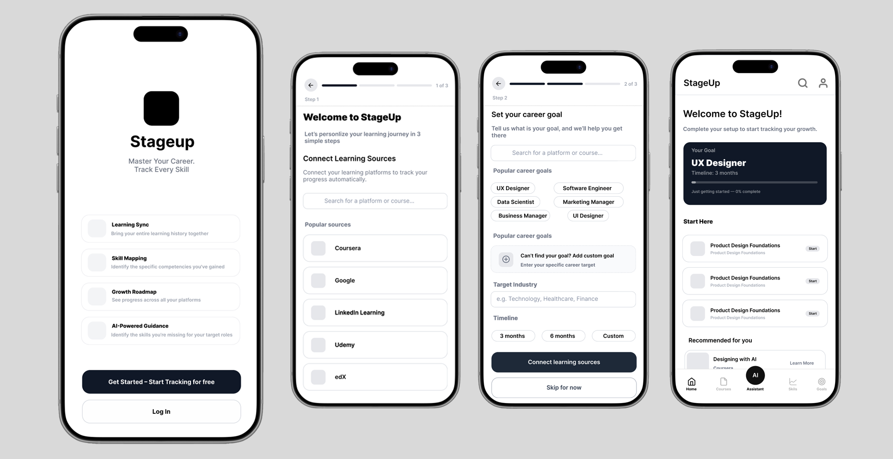
The platform separates the setup experience from the daily usage experience. Pre-login covers the landing page, features, pricing, and authentication. Post-login begins with onboarding where users connect their learning sources and set their career goal, then moves into the main dashboard.
Connecting a Learning Source
The most critical onboarding action is connecting a learning platform. Without learning data the product cannot generate skill insights or personalized recommendations. The flow includes a recovery path in case the platform connection fails, ensuring users are never stuck without a next step.
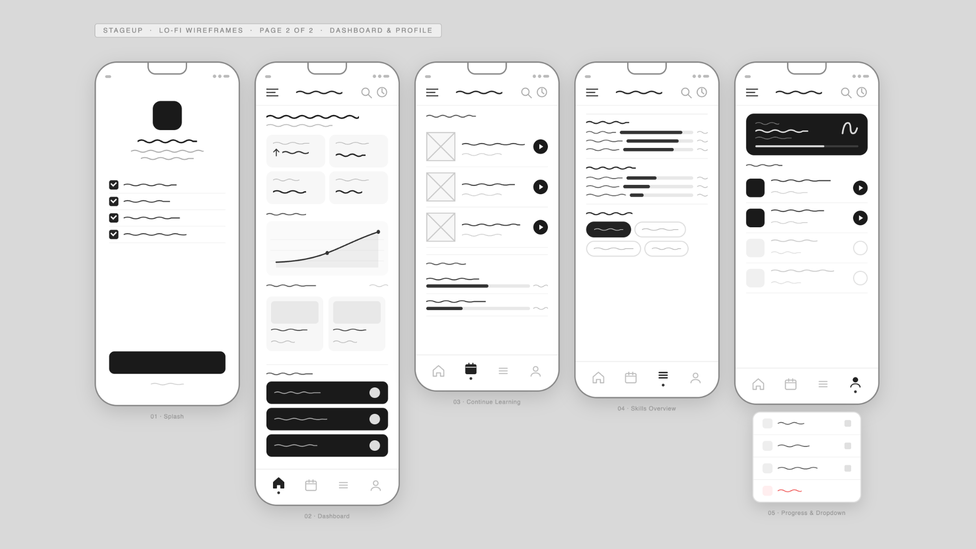
Before moving into high fidelity design, I mapped out the core screens in low fidelity. The goal at this stage was to focus entirely on structure, layout, and user flow without getting distracted by visual details. The wireframes are divided into two sections — onboarding and home, and the dashboard and profile experience.

With the low fidelity structure validated, I moved into mid fidelity to bring the product closer to its final form. At this stage I introduced real content, refined the visual hierarchy, and defined the core UI components. This allowed me to test how the design felt with actual data before committing to the final visual direction.
After testing the mid fidelity prototype with real users, I collected feedback on layout clarity, navigation flow, and how easily users could understand their skill progress. Several improvements were identified based on what users struggled with and what they responded to positively.The high fidelity design is the direct result of those iterations. I refined the typography, color system, spacing, and component consistency to create a polished and intuitive experience. Every screen was designed with two priorities in mind. Clarity of information so users always know where they are and what to do next. And motivation to keep learning so the product feels rewarding to use every day.
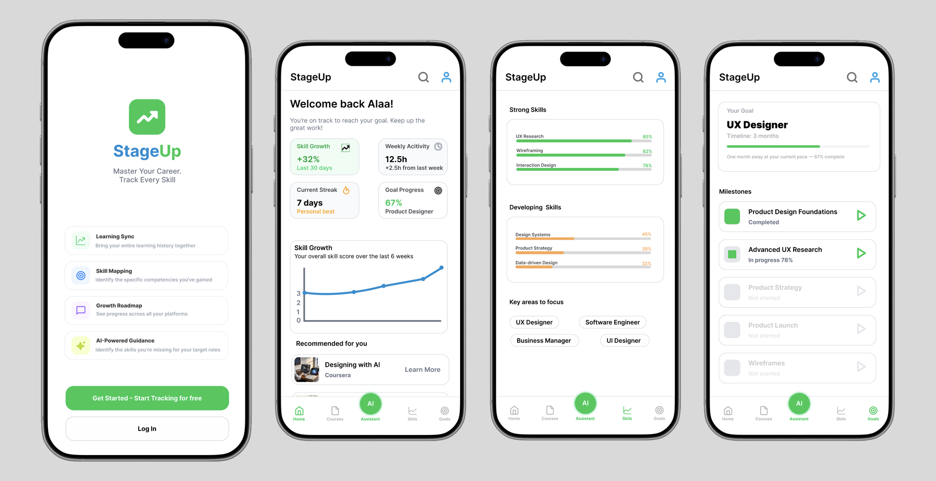
Skill Growth Visualization
Progress needed to feel real and motivating. I used an 8-week chart so users can see momentum building over time, not just a static number.
Career Goal as the North Star
Every screen connects back to the user's career goal. The dashboard always shows how far they are and what they still need to learn.
Mobile First
Most users check progress quickly on mobile. The most important information appears first without any scrolling needed.
Onboarding as a Trust Builder
I designed onboarding as a guided 3-step flow so users feel confident and understand the product before they reach the dashboard.
I conducted two rounds of usability testing throughout the design process. The first round tested the mid fidelity prototype to validate core flows before moving into high fidelity. The second round tested the final high fidelity prototype to confirm that the design improvements were successful.
Participants were asked to complete key tasks including connecting a learning source, setting a career goal, and navigating the dashboard.
Key Findings
Onboarding Was Clear and Easy to Follow
Users completed the 3-step onboarding flow without confusion and understood the product value immediately.
Career Goal Connection Was the Most Valued Feature
Every participant highlighted the career goal progress bar as the most useful part of the dashboard.
Navigation Needed SimplificationSome users were unsure which tab to use for finding new courses. This led to simplifying the navigation labels in the high fidelity version.
After applying the improvements from round one, I tested the final high fidelity prototype with users. The feedback was overwhelmingly positive.
Key Findings
Navigation Was Significantly Clearer
Users moved through the app confidently with no confusion about where to find courses or track their progress.
Visual Design Was Received Very Positively
Users responded enthusiastically to the polished interface, describing it as clean, motivating, and easy to use.
Skill Progress Visualization Was Highly Engaging
Users found the 8-week skill growth chart compelling and said it made them want to keep learning.
The Product Felt Complete and Ready to Use
Multiple participants said StageUp felt like a real product they would download and use immediately.
Throughout the design process I built and tested two interactive prototypes. The mid fidelity prototype was used to validate core flows with real users, and the high fidelity prototype represents the final polished experience.Explore the full high fidelity prototype below to experience the complete StageUp user journey from onboarding to the personalized dashboard.
StageUp taught me that the hardest design challenges are structural, not visual. The biggest problem was not how the product looked. It was how to create a meaningful system from learning data that was never designed to work together.Reframing the problem was the most important decision I made. Users do not want to simply sync their learning platforms. They want to become UX designers, get promoted, or transition into new careers. By focusing on career goals rather than course completion, StageUp transforms fragmented learning activity into a clear path for growth.Designing a long term feedback loop where the product becomes more useful the more it is used was the most valuable lesson from this project.
What I Would Build NextAI Powered Skill Recommendations
A smarter recommendation engine that learns from user behavior over time and suggests the most impactful next step toward their career goal.
Employer Integration
Connecting skill profiles to real job requirements so users can see exactly how their learning maps to roles they are applying for.
Progress Sharing
Allowing users to share their skill profile publicly, giving them a way to demonstrate real growth to employers beyond a traditional resume.